
DRAGONS! Dragons happen to fit right into this brand's identity. Kuniko's Teriyaki was founded in 2012 — the year of the dragon. The idea to check to see what year Kuniko's was established was the suggestion of one of my peers. Just another reason to work alongside others, good things come.
DRAGONS! Dragons happen to fit right into this brand's identity. Kuniko's Teriyaki was founded in 2012 — the year of the dragon. The idea to check to see what year Kuniko's was established was the suggestion of one of my peers. Just another reason to work alongside others, good things come.
I've called Grand Junction home for most of my life (for better or for worse), so having this project was a good treat. I remember coming to Kuniko's with my brother when I was in elementary school and he was the cool teenage brother who took me out to go get salmon onigiris. Man, I miss those things.
Kuniko's Teriyaki's wordmark made by modifying a typeface
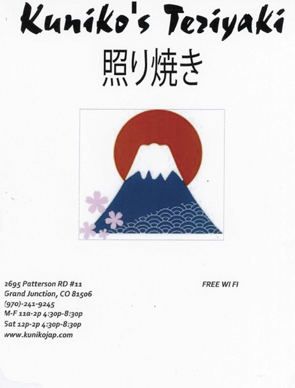
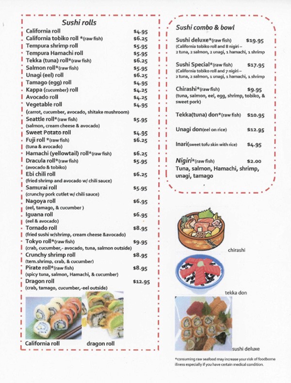
To start any project involving a redesign, you must first start off dissecting what doesn't work with the original.
confusing typography
inconsistent callout images
pixelization on images
kuniko's full redesign
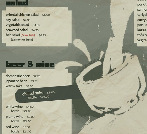
kuniko's close up of beer & wine section
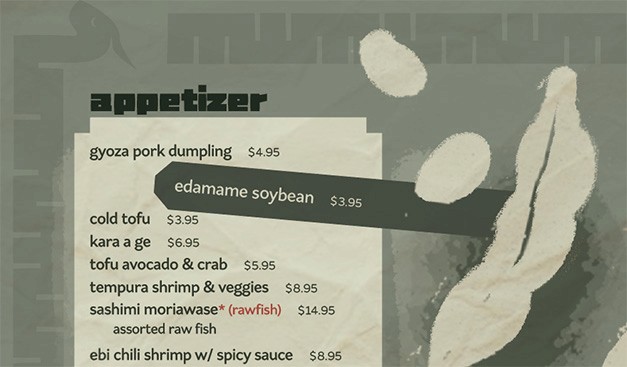
kuniko's close up of appetizer section
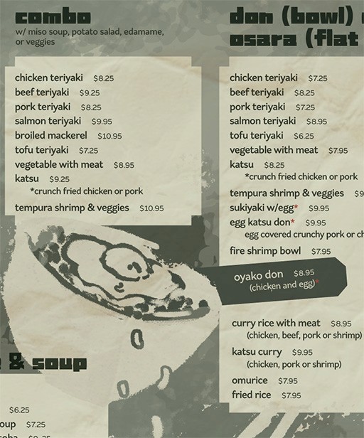
kuniko's close up of combo section
kuniko's close up of combo section
original Kuniko's Teriyaki menu
speed draw of some sushi dishes, all assigned a certain color from the redesign's color scheme.
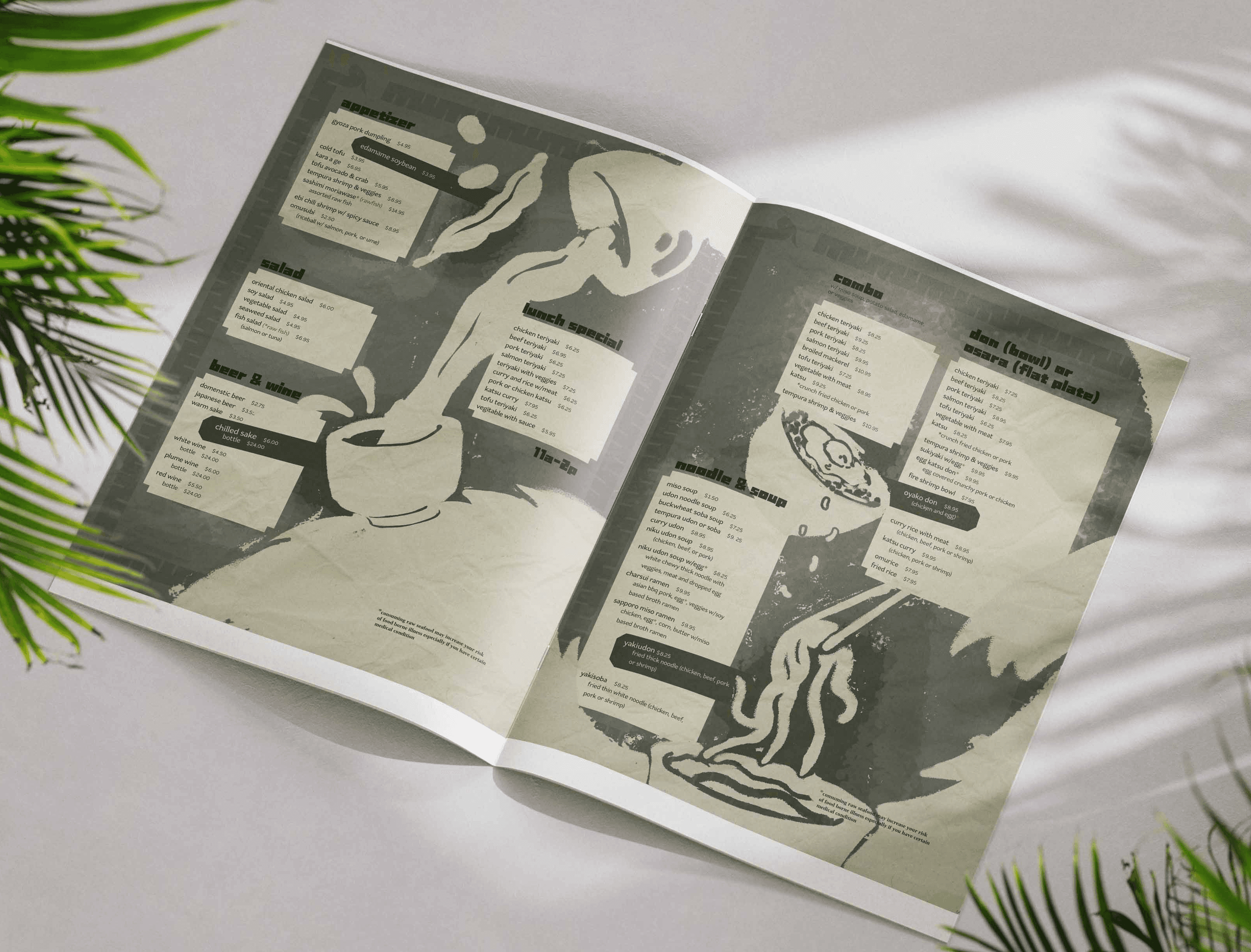
flip through of the Kuniko's Teriyaki menu redesign inside of the menu sleeve
flip through of the Kuniko's Teriyaki menu redesign inside of the menu sleeve
Remember that family-owned Japanese restaurant on Patterson, Kuniko's Teriyaki, that closed down a couple years back? Redesign their full menu, including a new modified typeface to have as their wordmark. The design should keep in mind home-office limits — this means no embossing, fancy paper, full bleed. Remember: the busniess' profits are of upmost importance, create a design that supports that.
Remember that family-owned Japanese restaurant on Patterson, Kuniko's Teriyaki, that closed down a couple years back? Redesign their full menu, including a new modified typeface to have as their wordmark. The design should keep in mind home-office limits — this means no embossing, fancy paper, full bleed. Remember: the busniess' profits are of upmost importance, create a design that supports that.
Remember that family-owned Japanese restaurant on Patterson, Kuniko's Teriyaki, that closed down a couple years back? Redesign their full menu, including a new modified typeface to have as their wordmark. The design should keep in mind home-office limits — this means no embossing, fancy paper, full bleed. Remember: the busniess' profits are of upmost importance, create a design that supports that.


evergreen
evergreen
Hex: #36806E
Hex: #36806E
primary color, mixed w/seaweed for page color
primary color, mixed w/seaweed for page color
seaweed
seaweed
Hex: #323C2E
Hex: #323C2E
secondary color, illustration background
secondary color, illustration background
pickled plum
pickled plum
Hex: #BF423A
Hex: #BF423A
secondary color, raw fish callout
secondary color, raw fish callout
papyrus
papyrus
Hex: #E3E4CD
Hex: #E3E4CD
primary color, main illustrations
primary color, main illustrations
mockup of the redesigned menu


confusing typography
inconsistent callout images
pixelization on images
To start any project involving a redesign, you must first start off dissecting what doesn't work with the original.
I've called Grand Junction home for most of my life (for better or for worse), so having this project was a good treat. I remember coming to Kuniko's with my brother when I was in elementary school and he was the cool teenage brother who took me out to go get salmon onigiris. Man, I miss those things.


copyright © 2025 Raine Foor
big buttons for big personalities <3